Cartoon Museum

This week, our class met at the Cartoon Museum on Russell Street. The Cartoon Museum is a small space dedicated to showcasing British cartoons and artists. It is one of the few, if not the only museum in London that is dedicated to preserving British cartoons.

The ground floor exhibit was entirely dedicated to showing work titled ‘The Estate of Martin Honeysett’; he was a British Cartoonist, and his work appeared in Punch, and in several newspapers in Britain. He was one of “the greatest gag cartoonists Britain has produced” (Pyne, 2015). There was quite a large range of work of his spread out along the ground floor, commemorating his reign over comics in Britain till his death in January 2015.

One of the pieces I enjoyed was from when Honeysett was invited to Japan, and subsequently made a series of drawings during his stay there. One particular drawing that caught my eye was titled ‘Cherry Blossom’:

17
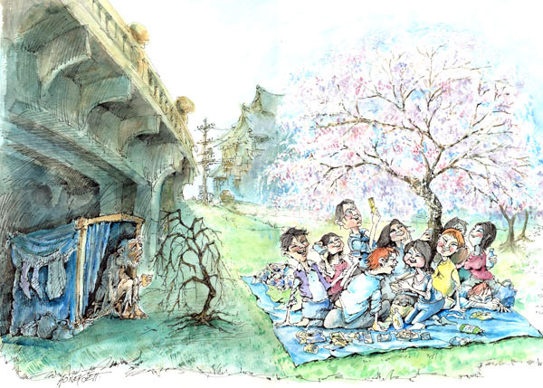
Cherry Blossom (Honeysett, undated):
‘The arrival of the cherry blossom is celebrated throughout Japan.

The piece stood out to me because of the stark and real contrast that is shown between two classes of citizen, and the ‘celebration’-so to speak- is an extension of your class. To me, this piece made it too easy for me to relate to what I have experienced in Pakistan. You see a wild difference of class in broad daylight, for example you will see upper-class families dining in an outdoor restaurant, and they will almost definitely be ‘harassed’ by a street beggar at their dining table.The nonchalance of those who lead relatively comfortable lives in comparison to the kind of pained expression on those who do not is striking.

On the upstairs floor of the Cartoon Museum, we were given a short but informative talk by curator of the gallery and a dear friend of our tutor Penn, Steve Marchant. He showed us a page from what is probably the most well-celebrated comics to ever be released, Watchmen (1986). This superhero story has a complex storyline written by Alan Moore, and arguably some of the best drawings by Dave Gibbons. It takes place in 1985, during the cold war, and shows a beautiful, emotional and dense take on nature through the story of a group of washed-up superheroes. Book critic Lev Grossman says about Watchmen, “Gibbons and Moore deployed about a dozen fugually interwoven plots and an intricate system of echoing visual motifs.” (Grossman, 2009).

We were shown a particular page from the comic book which showed Dave Gibbon’s drawing process, and were explained how a single page has to go through many different processes like storyboarding, sketching, ink lining, and several attempts of colouring before the artist can be satisfied with the final results.

a80b263aede6c2aa9b4abfd041fa50d1An original sketch of Rorschach, a character from Watchmen

Comix Creatrix

Comix are distinguishable from Comics in the fact that they are intended for a mature audience. The content involved in making Comix is much more sexual, promiscuous or political in nature. The term was just a respelling of the word Comics, and got their start in 1960’s, where specific titles such as Zap Comix, which was published by R. Crumb in 1968.

This week, we met at Central Saint Martins, where we paid a visit to The House of Illustration, which is located right next to the school. The current exhibition was of Comix Creatrix: 100 Women Making Comics.

The exhibition was interesting given the struggle many female graphic artists (or just female artists in general) face when trying to make their name in the industry: being overshadowed by the more well-known male artists. Just being in the space shed more light on and brought a more real-time realization of the male dominated world we live in, not just in art, but in sports, politics, literature and just general lifestyles. This also highlighted the progress women graphic artists are making in their field, with many artists making their name with a whole different range of art styles and stories.

The interesting part I realised was the range of different works I saw from all the different artists on display at the exhibition, with almost every type of story under their belt. Philippa Rice for example, is a multi-talented artist who, in her book ‘Soppy‘ (2014) wonderfully illustrates the everyday quiet moments of import that occur in a relationship. She takes the ‘mundane’ dwellings of everyday life and makes it look alive and animated.

8af27b70d7082b186dd1a09749bc4355
An illustration from Soppy

What stood out the most to me in the exhibition was the artwork dedicated to victims of abuse, harassment and social/cultural norms women are expected to live by and at the same time oppressed by. Becoming Unbecoming was a graphic narrative we had mentioned briefly in class, but seeing it at Comix Creatrix pushed me more towards reading it.

Kaveri Gopalakrishnan is another female illustrator, who quite hilariously outlines some of the struggles women (especially in India) have to face due to the large male-dominated society. She also illustrated habits some women have to adopt just to avoid sexual harassment.

209d9134804959-56de94f3acf90
Kaveri Gopalakrishnan: ‘Apocalyptic Scenarios of Modern Decline’ (2016)

3dd74728261273-563b5d1438035
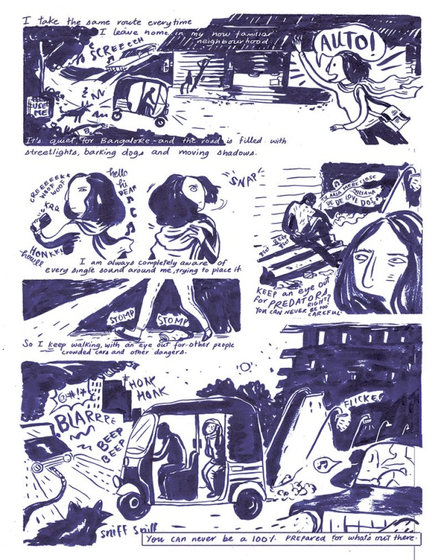
Kaveri Gopalakrishnan: ‘Before You Step Out’ (2015)

As a female artist, seeing the work of all the 100 women in the gallery was quite inspiring to see. For decades, the world of comic books has been dominated by male artists, and for the most part still is, but brings to realisation that the attention is shifting and so many female artists are now having their time in the limelight.

Taking a deeper look into comic books

We had a lecture by Dr. Monalesia Earle, who is a lecturer/teacher at Birkbeck, University of London. A very enthusiastic lecturer with a certain flair for explaining comics, she seemed to have a lot of experience on the subject matter, which proved to make for a very pleasant class. In the class, the main subject of her lecture was about ‘Interstitial Spaces in Comics and Graphic Narratives’.

She compared the visual grammar involved in comic books, and made us question how similar it was to  literary fiction. We discussed how the language in a novel might be more descriptive so that our imagination paints a picture of the story, whereas in a comic book, elements such as the composition of the drawings, emotions, panel layouts etc. paints a more vivid picture for readers. In that sense, we went on further to talking about whether novels could be adapted into graphic novels, or even graphic novels into movies.

Though there have been many successful adaptations from novels to graphic narratives, (The Metamorphasis by Kafka, Farenheight 451 by Bradbury etc) and even graphic narratives to movies (Persepolis by Satrapi, V for Vendetta by Lloyd), the risk of possibly ruining the author/illustrator’s intentions is very high.
Art Spiegelman for example was asked if he would like his comic Maus (1980) to be adapted into a movie, which he declined. In an interview, when he was asked why, he states, “I don’t think it would work,” and continues on to explain, “…to me, Maus found it’s proper form and it took me thirteen years to give it that form. I’m not interested especially in seeing that diminished.” (Joseph Witek, 2007)

Monalesia went on to explaining grammar you would find typically any time you look in a comic book: panels, speech balloons, captions, and gutters. The Lexicon of Comicana (1980) was a book she referenced to help when understanding the grammar behind a normal comic book page.

Talking about speech bubbles, we were shown a few slides showcasing a variety of bubbles.
(Left: dashed lines, grayed out colour and small text/big balloons show whispering)
(Top right: Radio balloons) (Bottom Right: Telepathic balloons)

Monalesia referenced Scott McCloud’s take on Gutters in comic books. She explained how gutters were spaces made to help with the imagination of the readers. The gutter has a relationship with the content in the panels. As seen below, he perfectly illustrates how people can create a relationship between two images in the gutter:

blog-uc-1Scott McCloud talking about gutters in his book Understanding Comics (1993)

It is important to note that the contents that make up the inside of comic books count for much more than just the storyline. Everything from the composition and layout of the pages, the flexibility in design of panel structures, the descriptions in captions and sound effects all add to the mood of the story.

Analysing Comics and Adaptations

BATMAN ARKHAM ASYLUM:A SERIOUS HOUSE ON SERIOUS EARTH (Dave McKean)

Batman Arkham Asylum: A Serious House on Serious Earth (McKean, 1989) is an intimate look into the psyche’s of characters in the world of Batman.  We as readers are taken into the murky depth of Arkham Asylum, trailing between two timelines: that of Amadeus Arkham, the founder of the facility in the 1920s, and the ‘present day’ Batman.

3247070-2926486957-tumbl
The book was hand-painted, and probably included one of the scariest and most grotesque depictions of the Joker. Throughout Batman’s journey into the Asylum, he appears as a ghost to guide and challenge him and his sanity; while at the same time we observe what makes the Joker and what fuels his every-day efforts. He pulls in Batman and demands that he finds where he truly belongs, that is inside Arkham with the rest of them.
The interesting theory the Joker refers to when he tells Batman if life in ‘the asylum’ gets too much for him, he’s always welcome in Arkham. He refers to the outside world as the asylum, pushing the idea that Batman is actually on the same level as those trapped in Arkham.

arkhamasylum3


PERSEPOLIS (Marjane Satrapi)

Graphic novel Persepolis (Satrapi, 2000) is a autobiographical account of Marjane Satrapi. It gives readers a firsthand look into how growing up with the war between Iran and Iraq tore apart families and reconstructed the face of society, especially the life of main character Satrapi. The cultural contrast shown in Persepolis is one of the strongest defining points of both the book(s) and the movie adaptation.

firstThe first two panels of Persepolis

It shows a wild disparity between the lives people lead inside and outside their homes. And it was this point that struck me most about Persepolis; the lifestyle in Pakistan, where I grew up holds many similarities to Satrapi’s depiction. Though not as extremist, the difference between the life lead in the privacy of homes is very different from those in the public space. Leaving the home as a woman in a male-dominated culture lead to being very cautious, and always having to fend off the leers and taunts of men who make it a point to blame the woman for not being covered properly instead of simply averting their eyes.

persepolis

The theme of conformity runs deep through the novel, with the headscarf and covering the body for women. Along with that, the citizens who conform under the ‘voice of authority’ undermining and trying to eliminate the (then current) system of education, the social ‘norms’ (such as drinking and having parties) and the freedom of the people in general. Along with this theme of conformity, our protagonist brings with her character a streak of rebellion which tries to cut the legs off ‘conforming’, constantly getting into trouble for being and acting different from how she was ‘supposed to’ act as a girl and a woman living in Iran.

persepolis-post-1

Introduction to Graphic Narratives

As a welcome introduction to my peers and my teacher, we were given a little exercise to draw ourselves with one truth and one lie, and to have people guess which was which. In this process, the tension of being in a new class filled with people you don’t know was somewhat distilled.

IMG_7322On the left: Me how I see myself in 20 years
On the right: Myself, with one truth and one lie.

The interesting part in the class however came later, when we were put in groups and had the task to make our own comic. Our group was given a still from the movie Assassin, of the heroin of the film walking out from behind a red curtain. With that image as our only lead on what we were to create, our group decided to get creative with story-boarding. Through discussion and an idea process that saw quite a few rejections, we (hopefully in unanimous agreement) settled on a fantasy-fiction that most definitely veered away from what the original movie was. Below is the still we based our story on:

IMG_7316 - CopyAssassin (Hsiao-Hsien Hou, et al, 2015)

After the general tone of the story was confirmed, we moved on to noting down points we could divide the story line into, to make designing the panel structure easier. We boiled it down to nine main points which would be the continuing focus:

IMG_7317
Using these, our group gained an idea of how the story would look, with visual references to street lights and shop walks like those in Hayao Miyazaki’s popular movie Spirited Away (Miyazaki, 2001) and cartoon Samurai Jack (Tartakovsky 2001-2006).
To summarize our story, we decided that the heroin was now a ‘demon’ assassin who, while walking down a lit street, hears the wails of a child some 3 panels down, who turns into an evil demon that is slain by the demon-assassin heroin. We decided not to add any conversation, and just leave ‘sound effects’ and silence to let the pictures speak for themselves.

IMG_7314

The experience of working as a group means compromise: you learn that sometimes plans will not turn out how you pictured them in your head. The making of graphic narratives is a process which involves many different stages from planning on paper to visual progression of images. A lot of other factors key in as well, such as the use of color, and the use of negative space, which when used correctly, can have a great impact on storytelling.

Animatronic Curiosity

“The larger than life-size grey figure wears clothes that flutter in the wind and is mounted on a plinth bearing no name but a very hard to read Latin inscription..” (Price, 2008)

The Statue on Summer Street in Southwark is right by my home; something I walk past every second day if not every day. I never noticed that it moved before, and came as a shock to me one day as I was walking past and I saw the head of the statue moving!

1195560409_80-177-117-97

The piece is called The Monument to the Unknown artist, but it still feels unusual not to hardly have any information as to where this statue is from, who the artist is and what his purpose was. There is only one small inscription on the side which reads in Latin, “Quid quid latine dictum sit, altum videtur” which upon a quick search I found translates to “Anything said in Latin sounds profound”. If you look at this from a different perspective, it is quite refreshing to have a statue with less information and more ‘action’ so to speak.

There are accounts of many people who go up to the statue and try to strike a pose, and when they don’t notice the statue it would strike a similar pose or make up one on it’s own. The interactive aspect of this public art piece is something that almost anyone and everyone can take part in, if they have the patience to wait for the statue.

A photographer Jessica Mulley wrote “As his head and eyes follow the movement of is hand as the brush traces its repetitive image in the air. It’s quite striking and, indeed, a little spooky in some ways. Catch it in the corner of your eye and you’re not quite sure whether its moved or not, so subtle is the change.” (Mulley, 2009). People go up to the statue, strike a pose and wait for it to move. A lot of people get frustrated when it doesn’t move, and a lot of people see the statue make small changes that make it very close to life.

The statue itself is animatronic, and upon doing some research, I found out that the use of sneakily positioned cameras map your body pose in 3D, and feed it to the statue who then copies your pose. This statue is a real hidden gem in the city of London, and as a piece of public art, does a very good job of interacting with the people that come up to it.

NoWhere Island…Where Exactly?

An island constructed mainly as a sculptural piece was created by artist Alex Hartley and produced by Bristol Art Organisers called Situations, the project took off on a journey around to form a part of the London 2012 Cultural Olympiad in summer 2012. Situations wrote on their site, “Nowhereisland is above all sculptural – a provocative and ambitious act of material displacement by the artist, which challenged our assumptions about the fixity of landscape.”

15-the-floating-island-on-tow-photo-tania-kovats-830x500

The popularity grew and the ‘nation’ of Nowhere Island quickly had more than 23,000 citizens, had travelled 2,500 miles and was greeted by thousands of people at harbours in South West shores of England. The project  gained a big following of people who call themselves Nowherians, and they come together and share their ideas and create rules for the island. In the one year duration of the project an entire community of people was built, who had their own input, putting forward ideas such as “no taxes,” and “free public toilets”.

As a piece of public art, it succeeds in involving the public in an interactive way, bringing them together. However, as public art it does too face some controversy, especially in relation to how much money was spent to fund its creation. Alex Hartley was given 500,000, and many people like Leo Hickman of The Guardian could argue that “we are constantly being told that every penny of public money counts,” and “We could all probably think of more urgent ways to spend that sort of money.” (Hickman, 2011) He goes on to say that he believes that it could “be wiser to spread it across the dozens of arts projects in desperate need of funding, rather than hand it to one lucky recipient”

8-nowhereisland-constitution-becomes-talking-point-at-tolpuddle-festival-photo-max-mcclure-830x500

People gathered from different types of lifestyles and welcomed Nowhere Island in high fashion. I find it strange how nobody was allowed to go onto the Island, but people could sign up to become a citizen  of a community. Alex Hartley found the island in the Norwegian glaciers, and when he finally got the funding by the Arts Council, went back and excavated the chunk of land they called the “island”. Taking it away from where he originally found it, making it into an art piece and tugging it around makes the piece lose it’s originality.

ArcelorMittal Orbit Structure

In the middle of NOWHERE, the ArcelorMittal Orbit structure towers above both the Olympic Stadium and the Aquatic Centre that surround it.
Designed by Anish Kapoor and Cecil Balmond for the London Olympics 2012, the structure stands tall in Queen Elizabeth Olympic Park.

arcelormittal_orbit_olympic_park_stratford_london29july2012

From afar, my first opinions of the structure was that it definitely stood out in comparison to its neighbours, but not necessarily in a good way. On a grey, dismal and cold day, the structure seemed lost and abandoned, almost like an incomplete project no one bothered to finish. It almost struck me as the start to a theme park; it almost looked like the start to a wild and wacky ride that was ‘soon to be’.

Getting right outside the structure itself, my feelings were a little mixed: I was anxious, one to get to the top to see what it was like, and two of how I knew I was going to feel being at the top, standing on a thin metal plate almost 376 feet high (in case you were wondering, I’m not too good with heights). Nonetheless, I was happy to know we weren’t about to WALK up the side!

Getting to the giant brass cone-like structure by the base of the structure, it did not match with the rest of the designs and there was an imbalance of material used. I didn’t understand the purpose of it being there; it seemed useless and more like a decoration piece that can allow you to play with the acoustics of the seemingly detached part. Going up the elevator we could hardly see outside the small portholes, and when we got to the top, we were confused by the existence of the giant curved mirrors, finding it mildly amusing but with no relation to the ‘whole picture’ so to speak.
Anish Kapoor says that “I wanted the sensation of instability, something that was continually in movement… it is an object that cannot be perceived as having a singular image from any one perspective.” (Glancey, 2012), and I believe instability is what he achieved.

While I can imagine how there must have been a lot of people who came out and crowded the area during the time of the Olympics, looking at it in perspective at the time of our visit, the surrounding area seemed more or less abandoned and with construction work going on our view from the platform was sort of ruined.

Travelling between platforms and eventually coming down off the side of the structure (well the other did anyway, my nervousness with heights took me straight to the elevator), I still felt disappointed that it ad not been as magnanimous as I had wanted it to be, or had pictured it in my head. The only exciting thing about the public art was the way my heart raced while I was at the top standing outside in the wind!

Peckham Peace Wall

Peckham was one of the few regions in London to be affected by the horrific riots that followed the death of Mark Duggan at the hands of the police in August 2011. After the chaos passed over, the people of Peckham picked themselves up instead to share more feelings of love than hate. The Peckham Peace wall project started out on a small board used to cover a broken window, and with more and more people coming to write their personal messages, grew to become a symbol of the peace and love that the public worked towards every day. To commemorate the anniversary of this wall, the exhibit was made permanent and can now be seen openly in Peckham Square today.

Visiting the Peckham Peace Wall, I found it to be a place that was seemingly easy to get to: it was a place that was quite central to Peckham, right off the High Street.

Peckham Wall

From far away at first glance it seemed just like a really colourful plaque, with no real significance to it; coming close though (and having known about the piece itself) you can tell that there is writing on each coloured square: a mix of printed and hand-written messages by the people and for the people of Peckham, talking against violence, brutality and harsh conditions in Peckham and promoting messages of peace and love. “Thousands of local people added their positive comments on the board, encouraging people to talk, to write, to be inspired and to remember the positive. The wall became a popular meeting place that week, where the people of Peckham came together to talk about the recent violence, to discuss solutions and to remember why they love Peckham.” (Begum, 2012)

IMG_5907 IMG_5909

Amongst the messages of peace, there were random messages that held no context to the idea of the ‘Peace Wall’, and people seemed to take it as an opportunity to write anything they desired, even if it was vulgar.

When I saw the Peckham Peace Wall, I did notice how people did glance at it as they walked by, but it doesn’t seem like the type of place tourists would go out of their way to see. If I were to hold interviews and ask random passers-by on the street what they think about the public art piece, the number of people who live in Peckham especially through the riots would probably respond with more personal positivity as compared to those who would be visiting, and Tom Jones says that the permanency of the wall was “to create a piece of public art which no-one can accuse of lacking meaning.” (Jones, 2013)

Since the project became a permanent public exhibit, the “hand tracing” done by commissioned artists decreased the authenticity of the piece, and the raw written notes became lost in a sea of digital printing. The original post-it notes are now preserved behind glass and displayed in the library just by Peckham Square, also for anyone to come and see. In an interview with Emily Druiff, the director of Peckham space, when asked what her favourite part about the piece was, she replied saying that she loves “the fact that this is a project that has grown out of people’s passion for the area and the need to keep the streets a safe place to be” (Morris, Dazed, 2012) With a platform on which the people of Peckham could have their words heard, the tension of the riots slowly turned to a calm and made more room for the rebuilding of the area. When the time came to remove the original board on which people wrote, by popular public vote, became a permanent part of Peckham. It could even be called community art.

That said, I was more than slightly shocked to find out that a print of the original notes are on sale, and can be bought for the mere price of around £68!! To me, seeing a piece of public art go on sale to the public itself makes me question what public art is exactly, and who has the ultimate say in it, if not the public?

Skoghall Konsthall

I was really intrigued by Alfredo Jaar’s one day exhibition in Skoghall (Sweden). Shocked by the lack of ‘any visible or cultural exhibition space’ in the span of thirty years, Jaar depicted this absence perfectly in the short-lived existence of his public art piece.

“Skoghall Konsthall” (Nicholas Jaar, 2000)

The museum was constructed out of paper and it’s presence was the first cultural institution that the citizens had seen. Jaar invited many artists from neighbouring cities who also worked with paper and along with the towns-people who came to see the exhibit, gathered quite a large crowd.

24 hours after the opening night, the museum was set ablaze and burnt to the ground. This act of creating and destroying was meant to show residents of Skoghall what ‘could have been’ and to push them to constructing a more permanent exhibit in their town.

As someone who has not only always been influenced and attracted to the visual but has also been surrounded by artistic influence, whether it be in the form of museums or television shows, the idea of an entire city having no visual conception or development seemed pretty far-fetched and empty. What I like about this public art show is how Nicholas Jaar appealed to an entire town all at the same time because of his message, and how strongly he put it out there.

The museum itself had its paper doors open to the public, and gave the people something they were not used to; their visual senses were captivated and they realised that this was somewhat a rarity for their home town. And it is this sense exactly that Jaar appealed to in his work.

Elena Shtromberg is  a professor in the department of Art and Art History in the University of Utah, and she had a chance to sit and talk to Jaar about his work. In her post she wrote, “The act of creation and destruction was meant to provoke Skoghall’s residents, showing them what having such an institution could have been and prompting them to instigate a more permanent construction.” (Shtromberg, 2013)

This is not the only piece of ‘prompting’ work that Jaar has produced. In Requiem for Leipzig (2005) which he discussed as a “failed project” (Shtromberg, 2013) he used a chandelier in a church to illuminate and dim according to the sound rising and dropping in Bach’s symphonies; he did this in order to show the poor state of culture in Liepzig. While it was meant to push people to start discussions about the lack of culture in the area, the audience was quite silent instead and so he considered it to have failed.